
01Direction
A visual idea worth remembering.
Typography, imagery and colour work as one composition. We give the brand a clear atmosphere rather than a collection of safe sections.
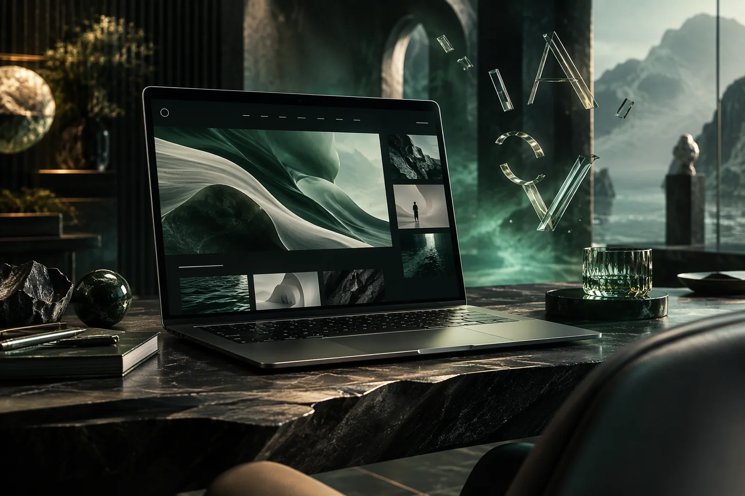
Expressive digital experiences where art direction meets performance — designed to be remembered and engineered to be trusted.
The brief behind the build
People do not experience your brand in a wireframe. They meet it in motion, in the pace of a scroll, in the confidence of a headline and the ease of the next step.
We design the whole atmosphere — then engineer it to survive real devices, real networks and real attention spans. The result feels crafted because it is: every transition, crop and line break has a reason.
What we make
From the first viewport to the final interaction, these are the choices that separate a template from a place people want to be.
Typography, imagery and colour work as one composition. We give the brand a clear atmosphere rather than a collection of safe sections.
The page should answer the next question before it is asked. We build a rhythm of proof, clarity and invitation — not a wall of claims.
Parallax, reveals and 3D are used to guide attention and create atmosphere. Every effect respects reduced-motion preferences and older devices.
Enquiry paths, booking and follow-up are designed as part of the page — not added as a form at the bottom. The journey continues after the click.
The build
We prototype in code early so the real experience — the load, the scroll, the hover, the mobile layout — becomes the design conversation.
Illustrative interface — not a live client project.
Process
A build with no black boxes. You see the direction early, the pages as they become real and the evidence behind every recommendation.
Discuss a websiteAudience, ambition and the decision the site must support. We agree what success looks like before choosing a single colour.
StrategyArt direction, content structure and interaction language arrive together as a working prototype.
DesignThe front-end build, CMS, integrations and accessibility pass. Every detail tested on real viewports.
DevelopmentLaunch, monitoring and a clear plan for the first ninety days of learning and refinement.
AftercareConnected next
A great website deserves discovery, conversation and a system that remembers. Explore the disciplines that complete the journey.
Send us the ambition, the constraints and the deadline. We’ll come back with a point of view.